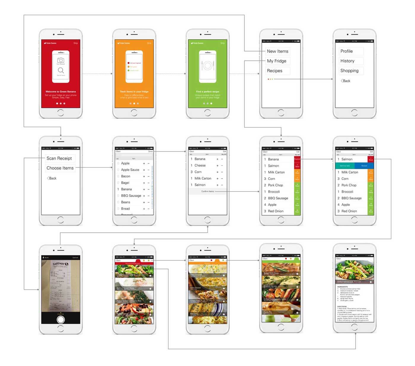
Simple and Easy to use, the app prototype that will change your thought of food waste forever. Mockup available in InVision.
Green Banana was a collaborative project for a home inventory mobile application which helps users track items in their refrigerator. It was created to solve food waste issue and save people money. Designed to be easy-to-use for everyone with a minimalist interface, useful functions, large type on a screen.
It targeted stay at home parents, office workers, and college students because these groups have similar problems about their waste on food. It helps users organize their home inventory, remind them to eat and cook their items in refrigerators, and cut spending on grocery.
It was designed in Sketch and Adobe Illustrator and prototyped in InVisionApp.
UI Process
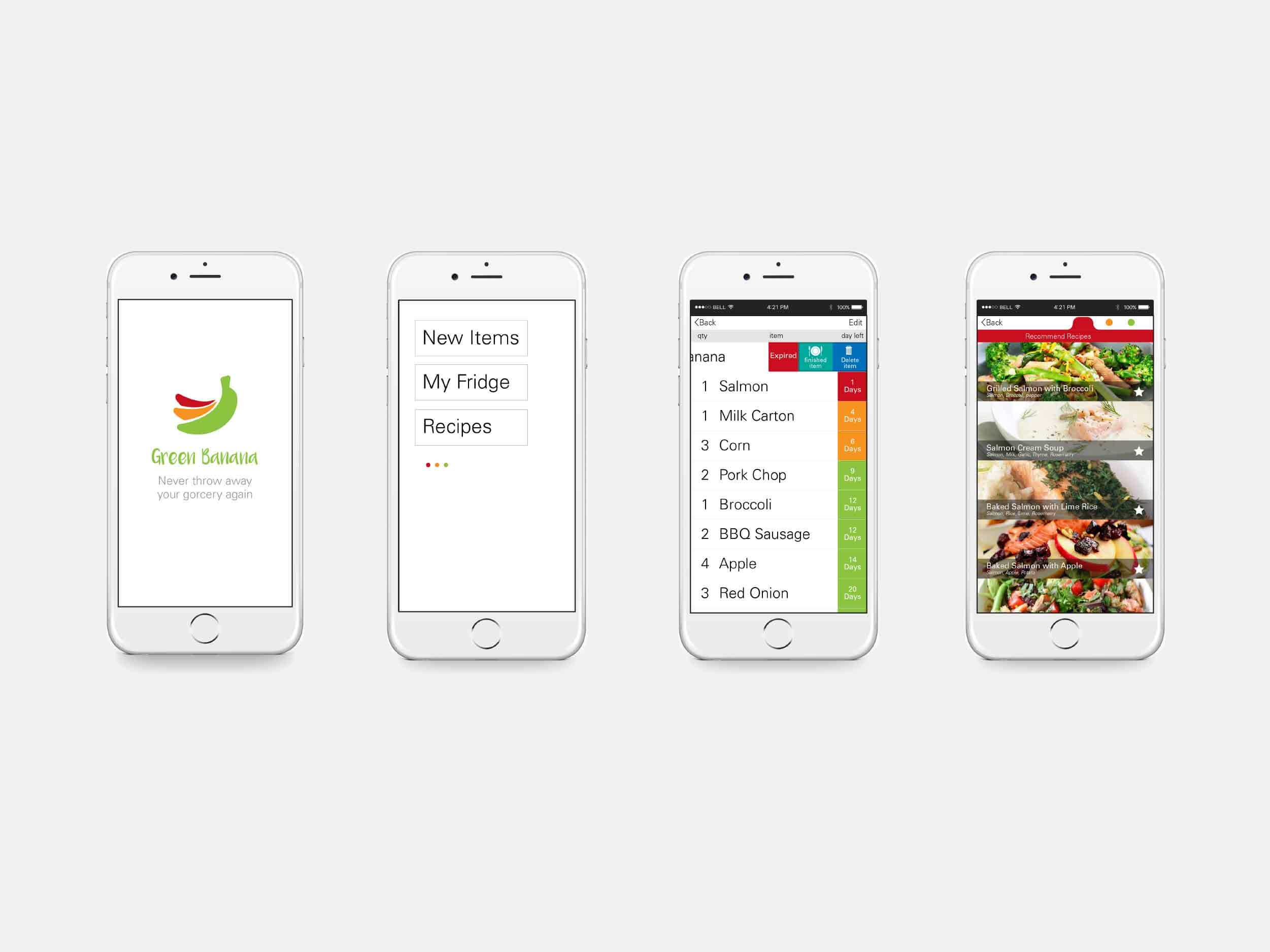
INTERACTION PROCESS
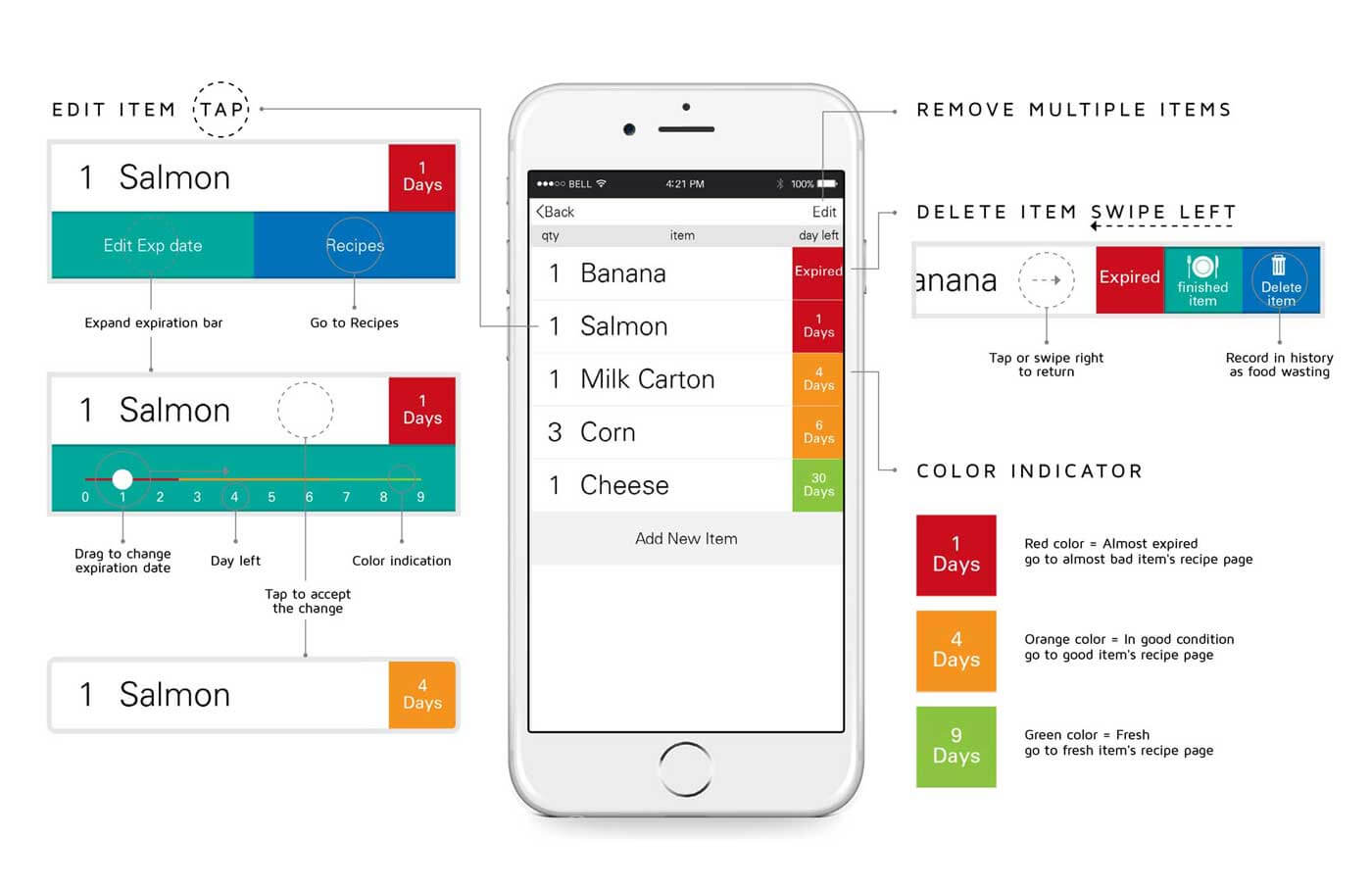
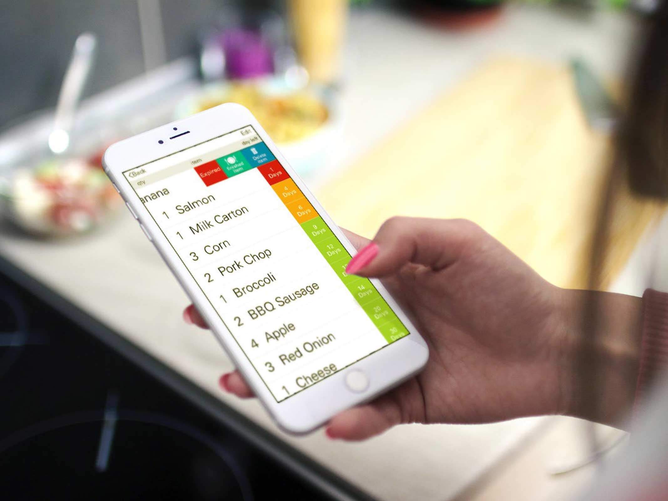
UX PROCESS
USER RESEARCH
The survey was sent out to potential clients who might be interested in using the app. The survey covered general questions, for example, gender, age, and more specific questions such as, how often the client cooks. The survey also asked if people would be interested in an organization app that keeps track of their food. 90% answered the question with “yes.”
In conclusion, the survey showed that especially students and single people need more help organizing their food. People are too busy to keep track of their items and often forget to eat or use the food they have in their fridge. A lot of food and money gets wasted. The survey gave a better idea of the first and secondary devices, of the user interface and the functions of the app.
RESEARCH RESULTS
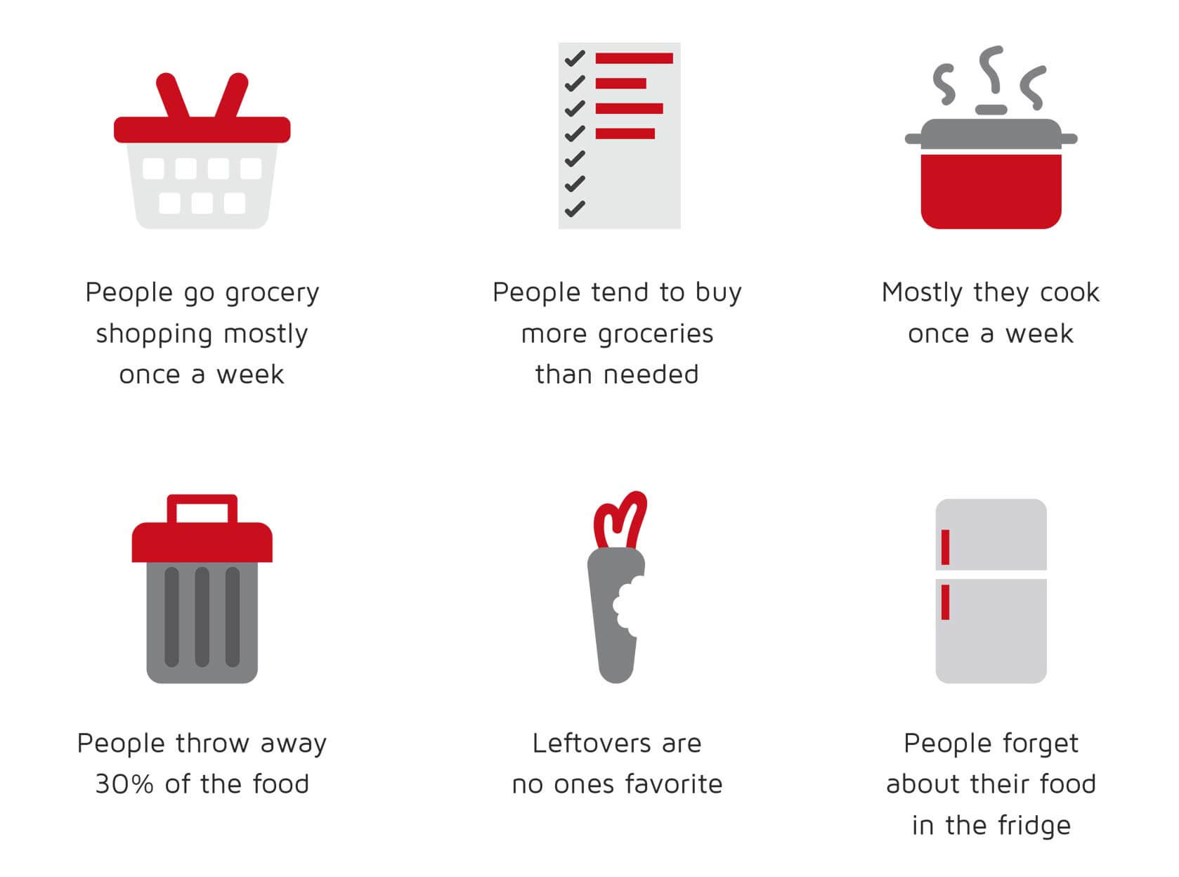
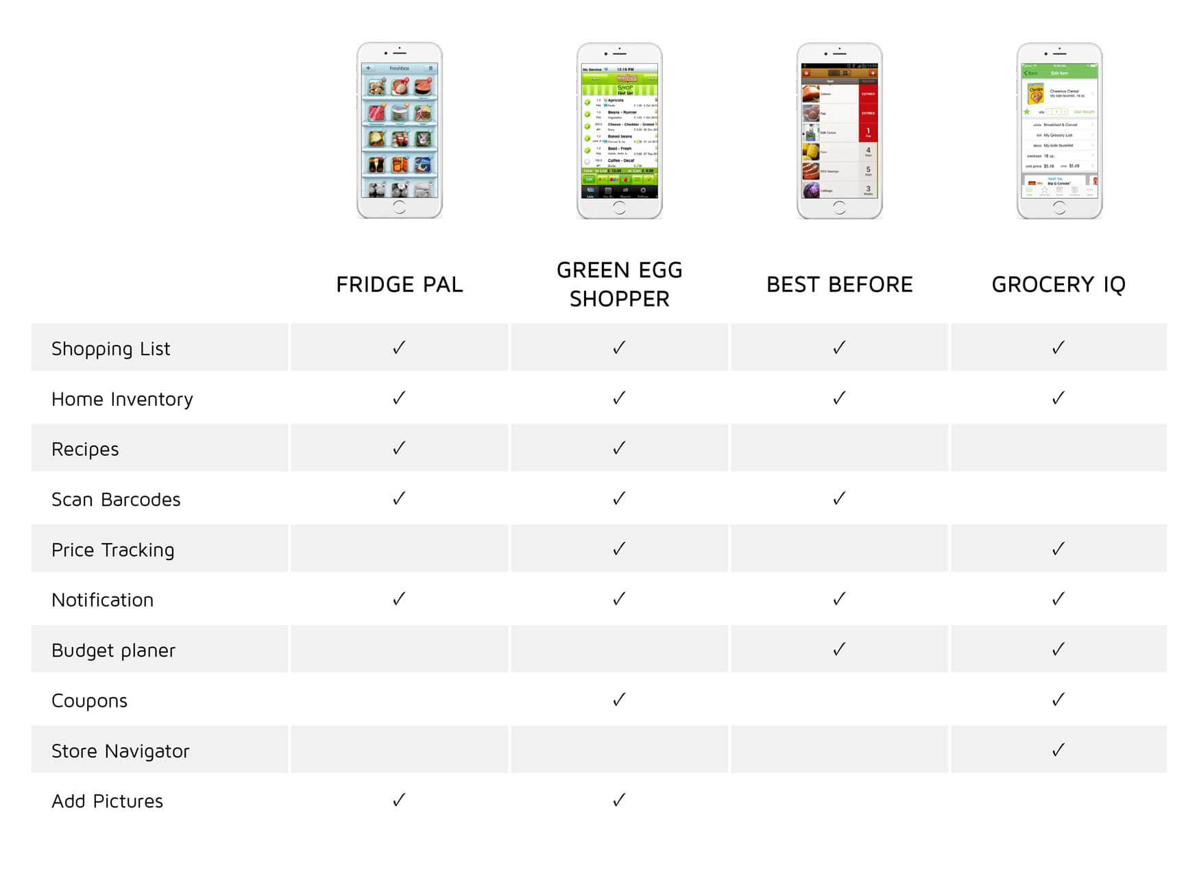
COMPETITIVE ANALYSIS
DISCOVER SUMMARY
Most people wanted a tool that focuses on saving money and time. These functions would be extremely valuable.
There are mobile applications in market which can solve some of the food wasting problem but most of them either have too many or lack of functions.
GOALS
- SIMPLIFY users life by managing their different food situations.
- LOWER WASTE on food.
- CREATE A ROUTINE using the app that lowers spending on groceries.
USER FINDING
Main target audiences are single people in their 20s and 30s. This demographic is usually busy working or attending school, so they have a higher chance of forgetting what they have in the fridge.
PERSONAS
PRIMARY
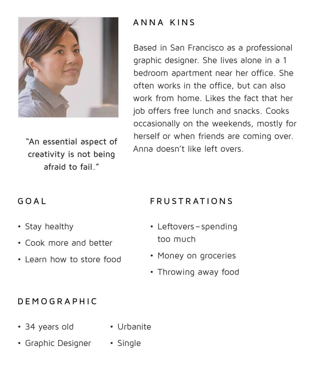
SECONDARY
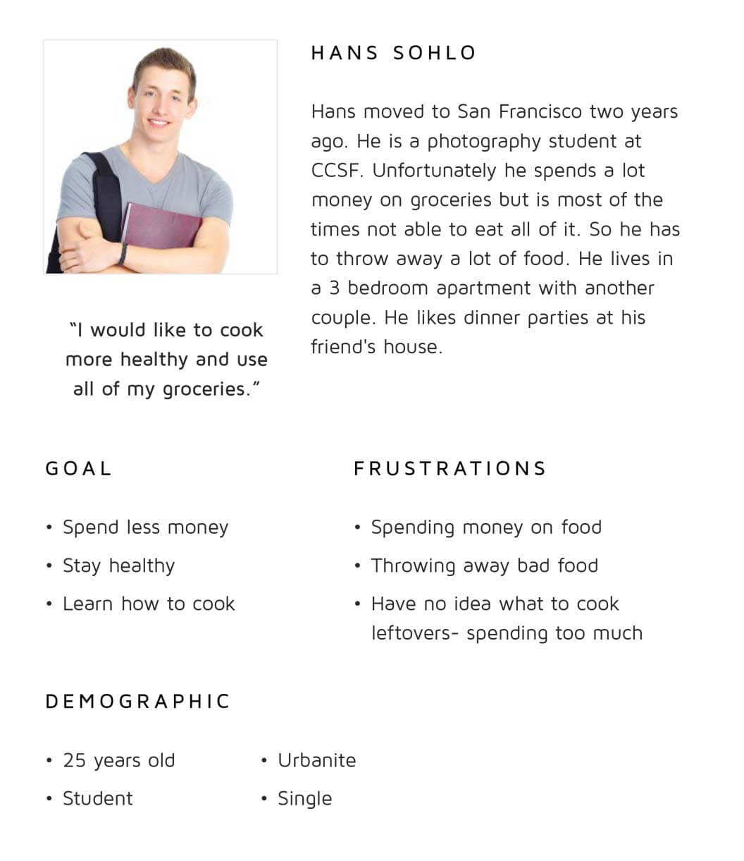
PRIORITIZE
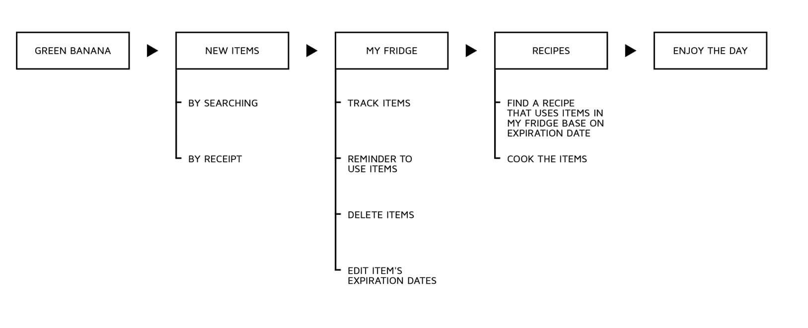
Functions were divided into three simple main categories: add, track, and cook items. The application also allows users to customize it to suit their habitsand needs.
PRIMARY
- Listing food items
- Scanning receipt
- Searching food items
- Notification
- Listing of recipes
SECONDARY
- History
- Profile
- Sharing SNS
- Help
USER FLOW
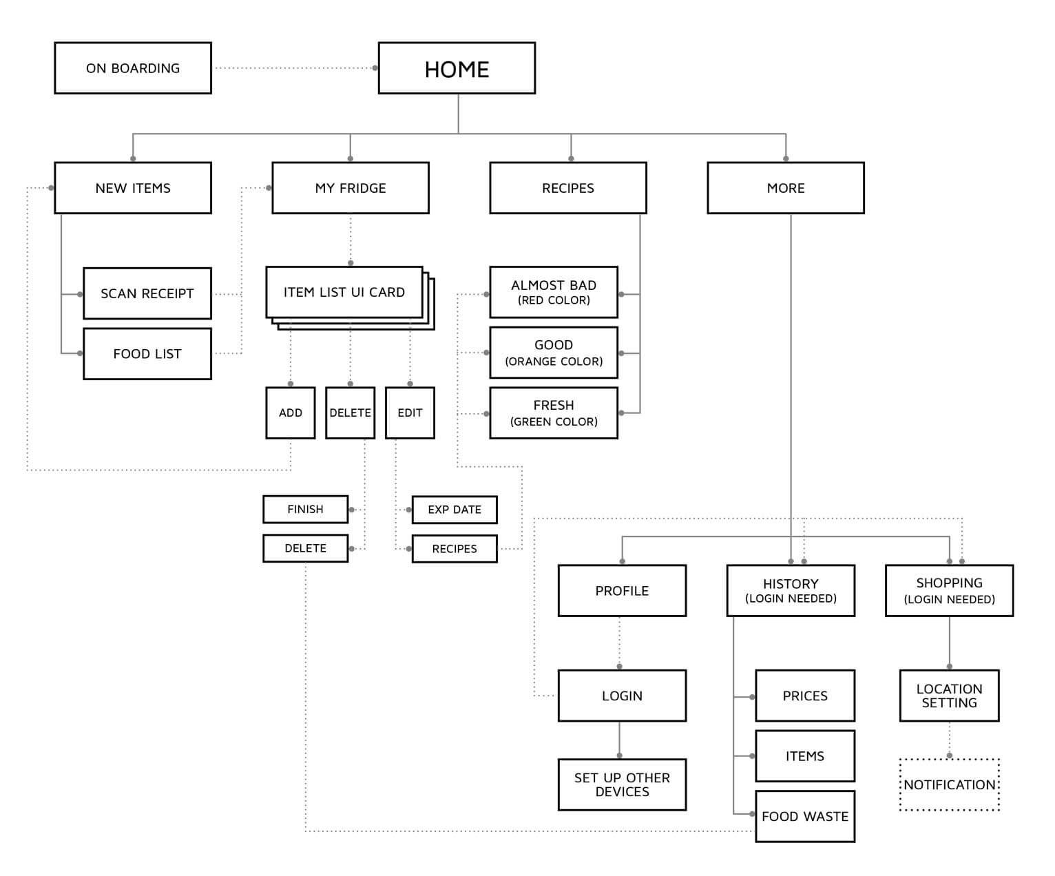
SITE MAP
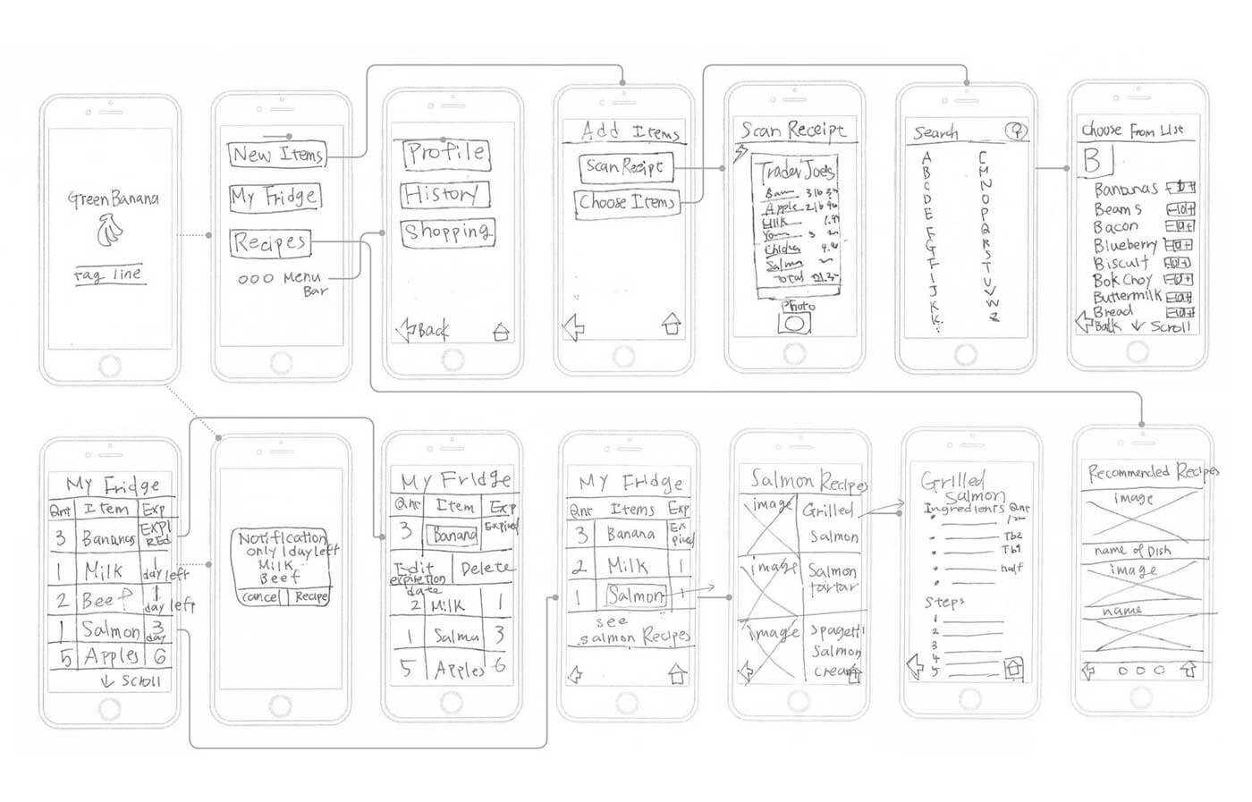
CONTRIBUTION
I was involved in all phases of this project, from conducting user research to building prototype. I was also in charge of Green Banana app design.
Work presented by Julia Sperling, Tomoko Sugiyama and I from September to November 2014 Project completed in the course “User Experience Design” under the instruction of Beth Cataldo.
